Distribution Range
A chart that plots every individual value of a numeric or date field can become unreadable fast. Age of the Ticket is a good example: with hundreds of tickets, you get hundreds of distinct ages. Distribution Range lets the admin bucket those values into ranges (e.g. <1d, 1-2d, 2-5d, 5-7d, >1w) and plot the count in each range.
The chart still answers the same question, with far less noise.
Where it applies
| Chart type | Distribution Range |
|---|---|
| Pie chart | Yes |
| Donut chart | Yes |
| Bar chart | Yes |
| Stacked bar | Yes |
| Grouped bar | Yes |
| Number chart | Yes |
| Summary table | Yes |
| Row chart | Yes |
| Data table | No |
| Series chart | No |
| Scatter chart | No |
| Line chart | No |
The four "No" chart types already preserve every data point by design (a line chart of ticket age over time only makes sense with the raw values), so bucketing isn't offered there.
Turning it on
Open the chart in Edit Chart and toggle Set Distribution Range on. The range editor appears below.
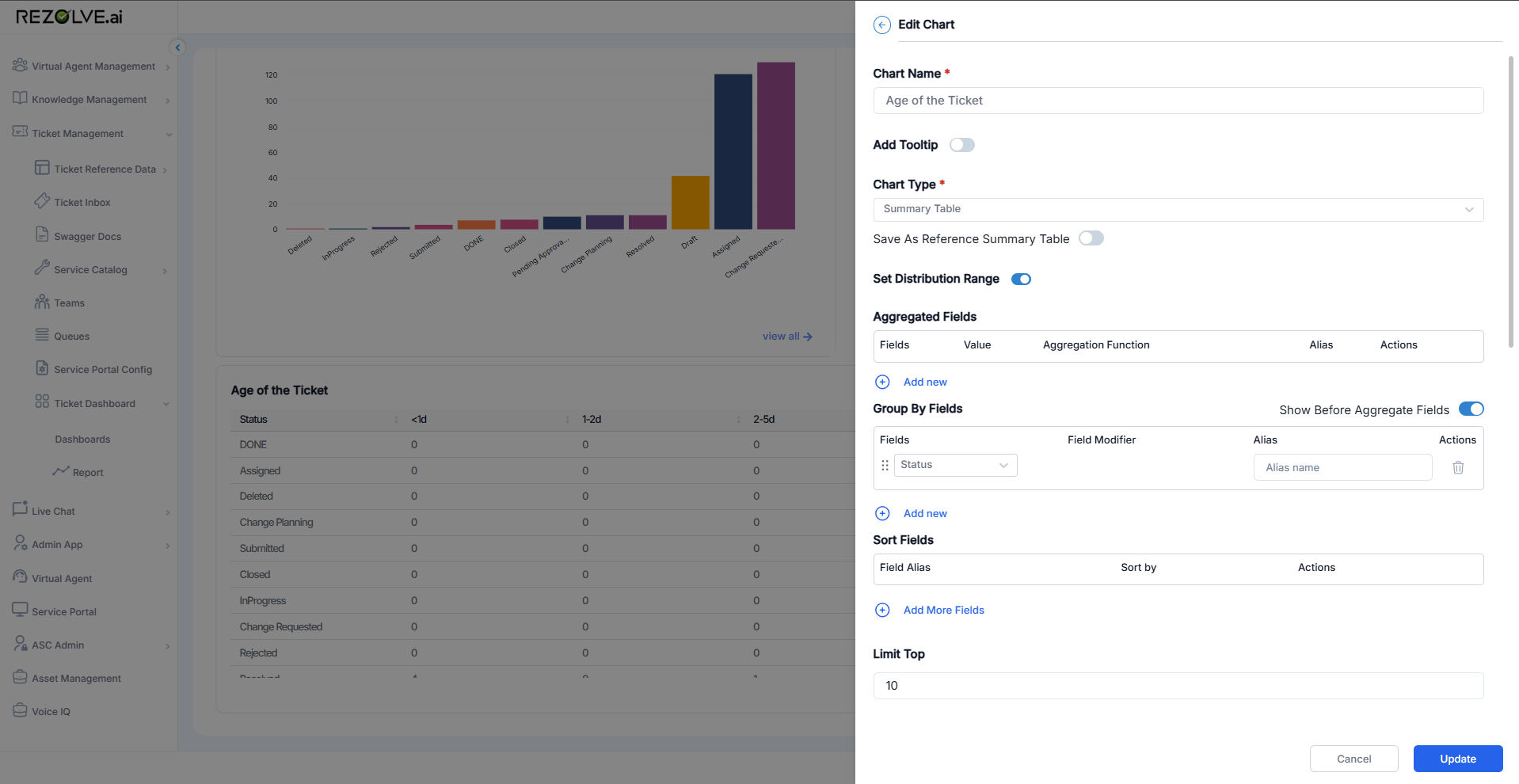
Configuring the ranges
The Distribution Range section has three blocks: a source definition, a measure, and the range list itself.
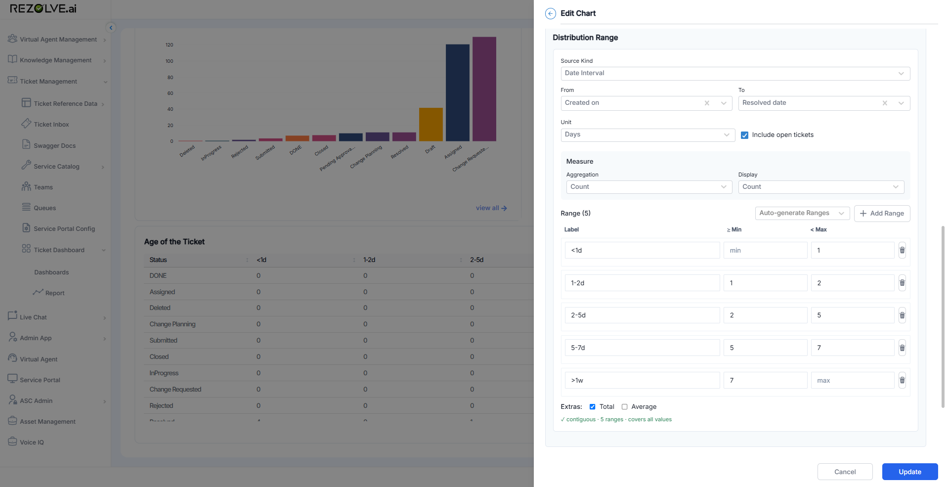
Source
- Source Kind - what kind of value is being bucketed. Use Date Interval to bucket the gap between two dates (the most common case for ticket age, resolution time, time-to-first-response). Other kinds are available for non-date numeric fields.
- From and To - the two dates whose gap is bucketed. In the screenshot, Created on to Resolved date gives ticket-age-from-creation-to-resolution.
- Unit - the unit ranges are expressed in (Minutes, Hours, Days, Weeks).
- Include open tickets - when on, tickets that haven't yet hit the To field (e.g. unresolved) are still counted, measured against now. When off, they're excluded.
Measure
- Aggregation - how rows are rolled up into a number per bucket. Count is most common; sums and averages are available for numeric measures.
- Display - how that number is shown on the chart (Count, percent of total, etc.).
Ranges
Each row is one bucket with three columns:
- Label - what the bucket is called on the chart (
<1d,1-2d,2-5d, ...). - Min (inclusive) - the lower bound in the chosen unit. Leave empty for "no lower bound" (used for the leftmost bucket like
<1d). - Max (exclusive) - the upper bound. Leave empty for "no upper bound" (used for the rightmost bucket like
>1w).
Add as many rows as you need with Add Range, or click Auto-generate Ranges to fill the table from a quick presets dialog.
Status line
Below the range list, a status line summarises the configuration:
contiguous - 5 ranges - covers all values
The three pieces are independent checks:
- contiguous - no gaps between the buckets (e.g. one ends at 2, the next starts at 2).
- N ranges - count of buckets configured.
- covers all values - the leftmost bucket has no min and the rightmost has no max, so every possible value falls into a bucket.
If you see gaps or overlap on this line, fix the bucket boundaries before saving - the chart will count values inconsistently otherwise.
Extras
Two checkboxes below the ranges:
- Total - adds a Total bucket column showing the row sum.
- Average - adds an Average bucket column showing the row average.
Example: ticket age by status
Configured with Created on to Resolved date and the five buckets above, plus Group By Fields set to Status, the summary table renders status rows against bucket columns:
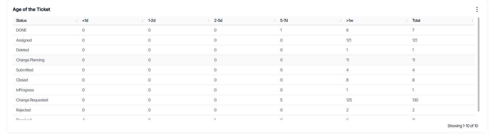
Each cell is the count of tickets in that status whose age sits in that bucket. The Total column on the right comes from the Total extra checkbox.
This view answers "how old are the open tickets in each status?" in one glance - the noise of every distinct duration is collapsed into five readable buckets.
Notes
- Distribution Range works alongside Group By Fields, not instead of it. The combination is what turns the chart into the pivot view shown above.
- Buckets are stored with the chart definition. Once saved, the chart re-renders against the current dataset every refresh; the bucket boundaries don't change unless you edit them.
- For a single-bucket equivalent of "how many tickets older than a week?" a Number chart plus a filter is usually simpler. Use Distribution Range when you need more than one bucket.