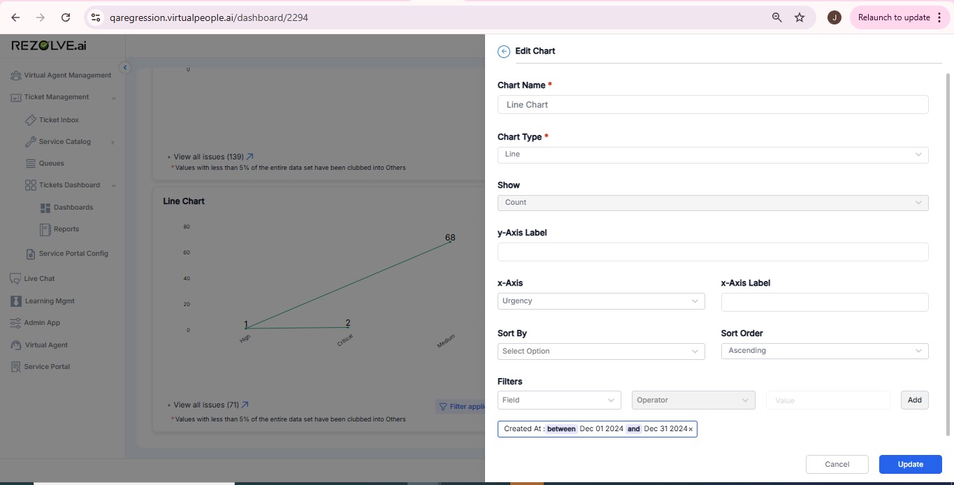
Line Chart
A Line Chart is used to visualize trends over time by connecting data points with a continuous line. It helps track fluctuations and patterns.
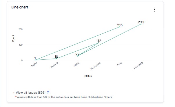
Use Case in Ticketing Dashboard
- Tracking Ticket Volumes: Monitor daily or weekly ticket counts to identify trends.
- Performance Monitoring: Track improvements in response or resolution times.
- Change Impact Analysis: Assess the effects of new policies or process improvements.
Example Configuration
Axis Configuration
- X-Axis: Date (daily, weekly, or monthly intervals)
- Y-Axis: Count of tickets
Filters
- Ticket Type: Specific categories (e.g., Incident, Request)
- Status: Current ticket states (e.g., Closed, Resolved, In Progress)
Additional Features
- X-Axis Selection: Dropdown for selecting time-based field
- Sorting: Value-based descending order
- Custom Filters: Status or type-specific filtering