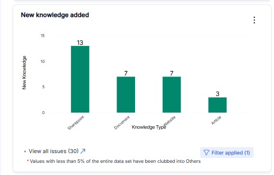
Bar Chart
Bar charts are a powerful visualization tool that helps compare and analyze ticket distribution based on different parameters such as teams, departments, or issue types. They provide a clear representation of how tickets are categorized and allow for quick decision-making.
Key Features
- Comparative Analysis: Visually compare ticket volumes across different categories.
- Trend Identification: Identify which teams or departments handle the highest number of tickets.
- Custom Sorting: Sort data in ascending or descending order for better clarity.
- Grouping Options: Group data by additional parameters to gain deeper insights.
Example Use Cases
1. Ticket Distribution by Team
- The x-axis represents different teams (e.g., IT Support, HR, Finance).
- The y-axis represents the number of tickets assigned to each team.
- Helps managers identify which teams are handling the most workload.
2. Ticket Types Across Departments
- The x-axis represents departments (e.g., Technical, Customer Support, Admin).
- The y-axis represents the number of tickets for each type (e.g., Bug Report, Feature Request).
- Useful for understanding which department faces the most issues.
3. Issue Type Breakdown
- The x-axis represents issue categories (e.g., Network Issue, Hardware Failure, Access Request).
- The y-axis shows the count of tickets under each category.
- Helps in resource allocation and proactive problem-solving.
Configuration in Dashboard
- Chart Type: Bar
- Show: Count / Sum / Average
- x-Axis: Type (e.g., Team, Department, Issue Type)
- y-Axis Label: Ticket Count
- Sort Order: Ascending or Descending
- Filters: Apply filters to focus on specific date ranges, priority levels, or other criteria