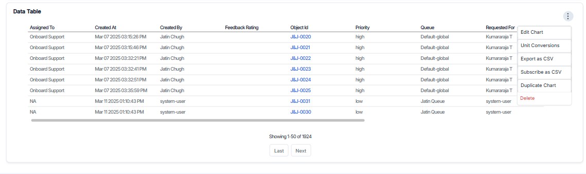
Data List
The Data List Chart provides a structured breakdown of ticket attributes, giving granular details about each ticket. This is useful for tracking individual records rather than just summarized metrics.
What This Chart Represents
A Data Table Chart provides a structured breakdown of ticket attributes, giving granular details about each ticket. This is useful for tracking individual records rather than just summarized metrics.
Key Use Cases
- Detailed Ticket Monitoring: Allows help desk teams to track tickets with attributes such as priority, assigned agent, and feedback ratings.
- Performance Analysis: Evaluates how quickly tickets are being handled by sorting them based on created time or priority.
- User and Agent Tracking: Identifies which agents are handling the most tickets and how users are interacting with the support system.
- Response Time Insights: If response times are included, it can help identify SLA breaches or delays.
- Quality Assessment: With feedback ratings, managers can assess customer satisfaction for different agents or ticket categories.
How Each Column Helps
| Column Name | Purpose |
|---|---|
| Assigned To | Shows which agent or team is handling the ticket. |
| Created At | Indicates when the ticket was created, useful for tracking resolution time. |
| Created By | Identifies the user who raised the ticket, allowing user-specific insights. |
| Feedback Rating | Captures customer feedback, helping assess support quality. |
| Object Id | A unique identifier for tracking specific tickets. |
| Priority | Helps sort and filter tickets based on urgency (High, Medium, Low). |
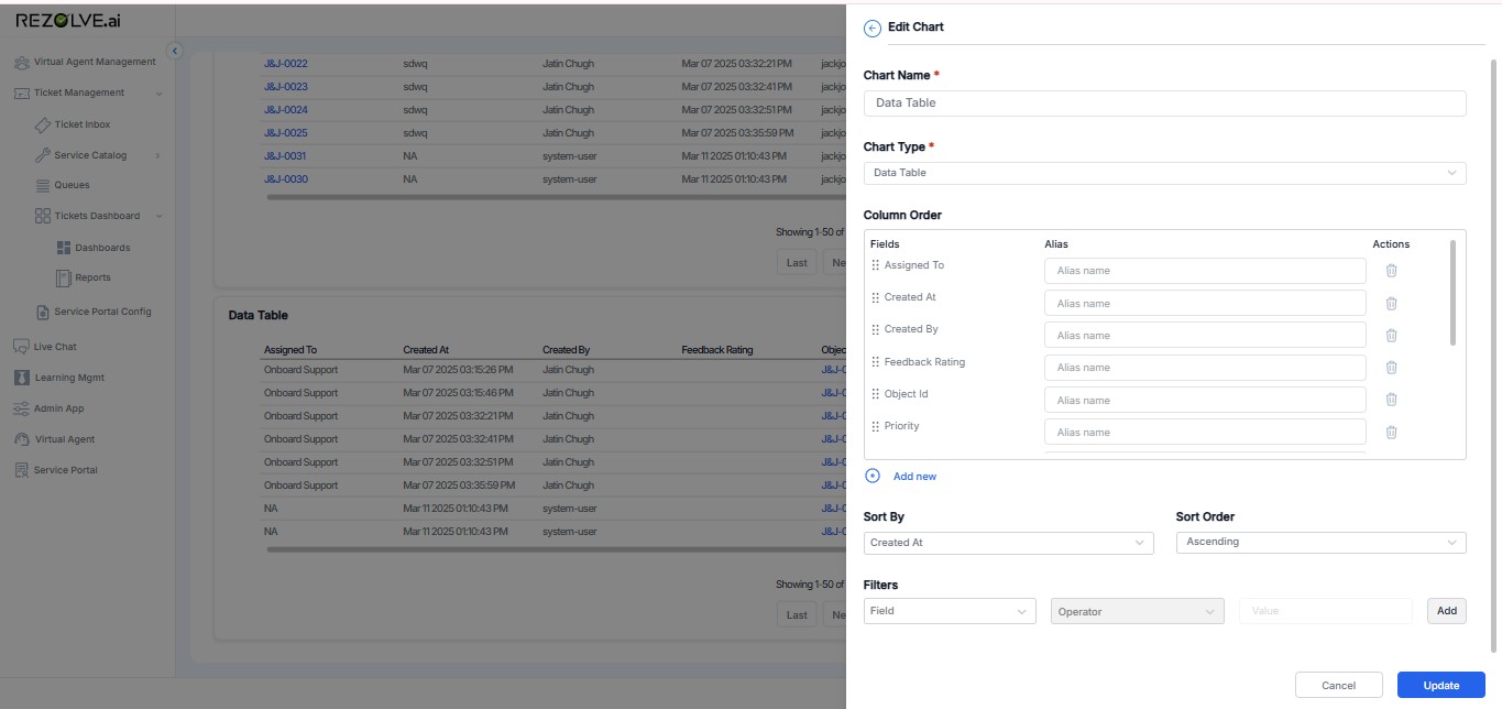
Customization & Enhancements
- Filters: Apply filters such as date range, priority, or category to refine the data.
- Sorting Options: Change sorting to "Descending" for the most recent tickets first.
- Additional Columns: Add fields like "Status," "Response Time," or "Category" for more in-depth analysis.
- Export Feature: If available, exporting the table to Excel or CSV can help in reporting and offline analysis.
Additional Features for Data Table Charts
-
Edit Chart
- Allows users to modify the chart settings, including columns, filters, sorting, and other configurations.
- Useful for making quick updates without creating a new chart from scratch.
-
Unit Conversions
- If applicable, this feature enables conversion of data values from one unit to another (e.g., time formats, currency, or measurement units).
- Helps in maintaining consistency in reporting when working with multiple units.
-
Export as CSV
- Allows users to download the table data in CSV format for offline analysis.
- Beneficial for sharing reports, conducting further analysis in Excel, or integrating with other tools.
-
Subscribe as CSV
- Users can subscribe to receive the latest data in CSV format at regular intervals (e.g., daily, weekly).
- Automates reporting and ensures that users always have up-to-date information without manually exporting data.
-
Duplicate Chart
- Creates a copy of the existing chart with the same configuration.
- Useful for making modifications to a chart without altering the original version.
-
Delete
- Permanently removes the chart from the dashboard.
- Ensures unwanted or outdated charts do not clutter the dashboard.
Best Practices for Using Data List Charts
- Apply Relevant Filters: Start with broader data and then apply filters to focus on specific issues or trends.
- Choose Essential Columns: Include only the most relevant columns to avoid information overload.
- Set Appropriate Sorting: Sort by priority for urgent issues or by creation date for chronological analysis.
- Regular Exports: Schedule regular exports for reporting to stakeholders or for archival purposes.
- Combine with Summary Charts: Use alongside summary charts to provide both detailed and high-level views of your ticket data.