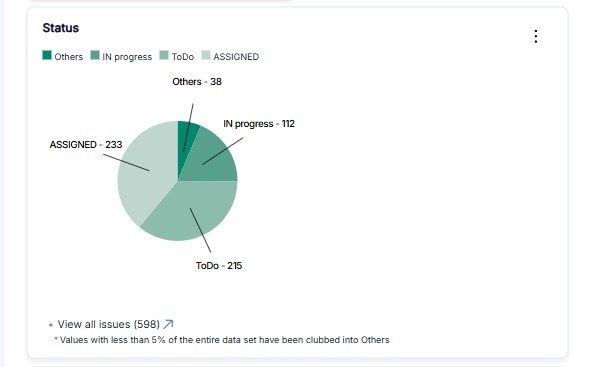
Pie Chart
Pie and donut charts are used to represent the proportion of different categories within a dataset. They help visualize how a whole is divided into parts, making it easy to identify dominant segments.
Key Features
- Proportional Representation: Shows the percentage share of each category.
- Comparative Analysis: Helps compare distribution among different channels, teams, or ticket types.
- Customizable Filters: Can be filtered by date, ticket type, priority, etc.
- Clear & Intuitive View: Ideal for understanding ticket distribution briefly.
Example Use Cases
1. Ticket Distribution by Channel
- The chart displays how tickets are distributed across different channels (Email, Chat, Phone, social media).
- Helps support teams identify the most used customer service channels.
2. Issue Type Breakdown
- Shows different types of issues (e.g., Bug Reports, Feature Requests, Access Issues).
- Helps in categorizing recurring problems and prioritizing resolutions.
3. Bot Conversations by Channel
- As seen in the image, the chart visualizes bot conversations across different platforms (e.g., Website, Mobile App, WhatsApp).
- Useful for analyzing chatbot engagement across multiple channels.
Configuration in Dashboard
-
Chart Type: Pie / Donut
-
Show: Count / Percentage
-
x-Axis: Source (e.g., Channel, Issue Type, Department)
-
Filters:
- Example: "Ticket Type is Conversation" (filters data to only show bot conversations)
- Other filters: Priority, Date Range, Response Time