Reports and Dashboards
Two related tools for looking at your inventory data: reports are saved queries you run on demand, dashboards are configurable widgets you keep visible.
Reports
A report is a saved combination of what data and how to filter and group it.
You can build reports against:
- Assets — laptops by category, retirements per quarter
- Licenses — utilisation by manufacturer, expiry windows
- CMDB — CIs by environment, critical CIs by status
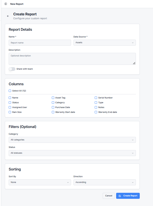
Building a report
Go to Reports → New Report. You'll pick:
- Data source — assets, licenses, or CIs
- Columns — what fields appear
- Filters — narrow the rows (e.g. status = Checked Out, purchase date in last 12 months)
- Grouping — group by category, manufacturer, etc.
- Sort order
Save with a name. The report is now reusable.
Running a report
Open it from the list and click Run. The report executes against your current data and renders a table. You can export the result to CSV.
Reports are not snapshots — every run uses the latest data. If you want a frozen point-in-time view, export and save the CSV.
Sharing reports
Reports are tenant-wide. Anyone with reporting access can run them. To restrict who can see specific reports, use your tenant's role-based access controls.
Dashboards
The dashboard is your home screen. By default it shows a few standard widgets — total assets, assets by status, licenses by manufacturer. You can add and rearrange your own.
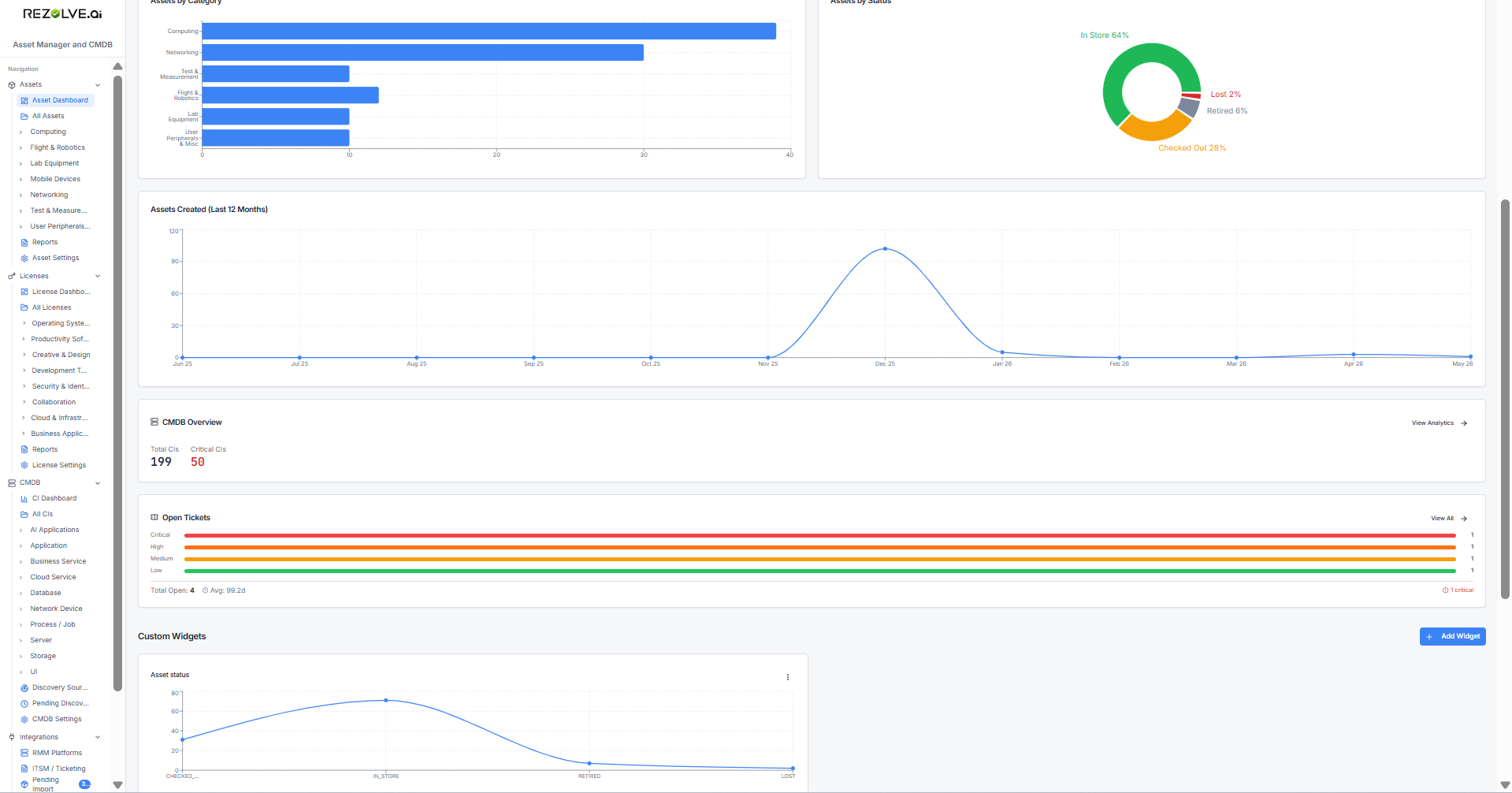
Widget types
| Widget type | What it shows |
|---|---|
| Number | A single big number (e.g. Total Assets: 1,247) |
| Bar chart | Counts grouped by a category |
| Pie chart | Proportional split (e.g. status mix) |
| Donut | Same as pie, hollow centre |
| Line chart | Trend over time |
Adding a widget
Click Add Widget. Choose:
- Data source — assets, licenses, or CIs
- Widget type — number, bar, pie, donut, line
- Group by — what dimension (category, status, month, manufacturer)
- Aggregation — count, sum, or average
- Size — small, medium, large
Rearranging
Drag widgets to reorder. Each user's dashboard layout is saved separately, so your preferences don't override your colleagues'.
When to use which
- Reports are best when you want columns and rows — list output, exportable.
- Dashboards are best for at-a-glance metrics — visual, persistent, no clicking.
You'll usually have both: a dashboard for the "is everything OK?" view, and reports for the "give me the spreadsheet" answer.
Related topics
- Alerts — for proactive notifications instead of pull-based reports
- Imports and Bulk Actions — for moving data out, not just looking at it