March Release

Release Date: March 7, 2025
This release introduces several new features and improvements including Creator Studio script validator for Adaptive Cards, dashboard filter enhancements with IS EMPTY operators, Bot Studio UI restrictions, attachment count display badges, color coding for flow editor components and ticket types, and Actor/Queue fields enhancement with hierarchy data mapping.
We're excited to announce our March 2025 release with several new features and improvements!
Release Date: 7th March
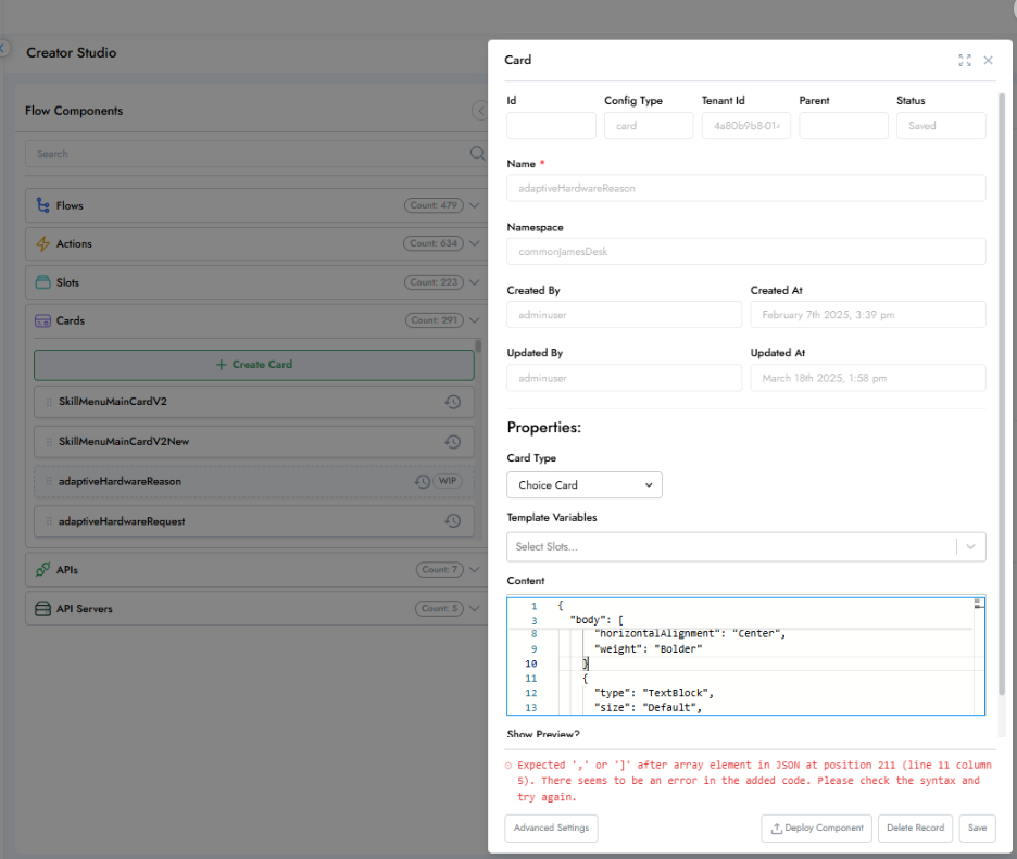
1: Creator Studio :Script Validator for Adaptive Cards
Overview
This release introduces a script validation feature within Creator Studio to enhance the development experience when working with Adaptive Cards.
New Capabilities
-
Script Validation: Creator Studio now includes a built-in code validator for Adaptive Card JSON scripts.
-
Error Highlighting: The validator highlights the specific line(s) where an error occurs in the Adaptive Card JSON content.
Problem Addressed
Previously, there was no validation for Adaptive Card JSON within Creator Studio. As a result, incorrect or malformed JSON could cause the bot flow to break without giving visibility into the issue, making it difficult for implementation engineers to debug. This feature solves that problem by providing immediate feedback and pinpointing issues within the Adaptive Card structure.
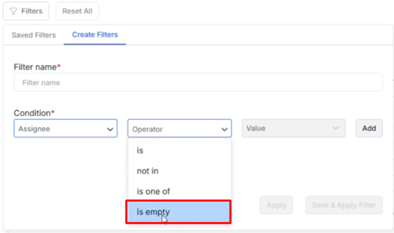
2: Dashboard - Support for "IS EMPTY" and related operators in filters
Overview
The Actor (Assigned To) field in dashboard filters now supports "IS EMPTY" and other logical operators to help users create more precise and insightful chart filters.
New Capabilities
-
Added Operator:
IS EMPTY- Enables filtering data where the Actor/Assigned To field is blank or unassigned.
-
Additional Operators Supported:
ISNOT INIS ONE OF
-
Improved Filter Flexibility:
- Allows users to include/exclude tickets where no actor is assigned, aiding better analysis of unassigned workloads.
Use Case
In dashboards like "My Workload Dashboard", users can now include a filter condition to identify incidents with no assignee (Actor IS EMPTY). This helps teams monitor backlog or unattended tickets more effectively.
Impact
- Enhances reporting accuracy for operational dashboards.
- Supports quicker detection of bottlenecks and assignment gaps.
- Streamlines chart customization for advanced analytics.
3: Bot Studio : UI Restriction in Production Folder and Default Component Visibility for ASC Admin
Overview
This update improves role-based access and environment-specific editing permissions in Bot Studio by modifying toolbar visibility and component toggling behavior.
Enhancements
Toolbar Removed in Production Folder
- The toolbar and interaction bar are now hidden in the Production folder.
- Editing actions like component addition or deletion are disabled, ensuring production integrity.
Toolbar Retained in Custom Folder
- The toolbar remains fully accessible in the Custom Folder, enabling flow creation, editing, and component manipulation where allowed.
ASC Admin Role: Default "Show All Components" Enabled
- For users with ASC Admin access:
- The "Show All Components" option is now automatically toggled ON.
- Eliminates the need to manually enable this setting every time.
Problem Addressed
- Previously, the production environment displayed an unused toolbar, causing confusion.
- "Show All Components" was hidden by default, requiring extra steps for admin users.
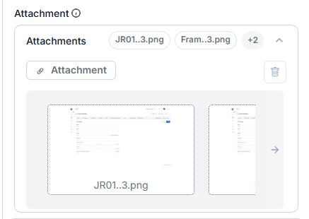
4: Attachment Count Display in Badges
Overview
Improved the user interface by enhancing the way attachment counts are displayed. This change makes it easier for users to quickly understand how many attachments are associated with a ticket or record.
Enhancements
Old Behavior:
- Attachment count was shown in brackets within the heading text: (e.g., "Attachments (1)")
New Behavior:
- Attachment count now appears as a badge, similar to modern UI patterns. (e.g., A "+2" badge is shown next to the visible files, indicating more attachments are hidden)
Benefits:
- Provides a cleaner and more intuitive layout.
- Improves visibility and accessibility of attachment metadata.
- Matches design consistency across Agent-UI components.
Visuals
Before:
Attachments (1)
After:
Attachments [ onboarding.pdf ][ employee_list.xls ][ assets_details.doc ][ +2 ]
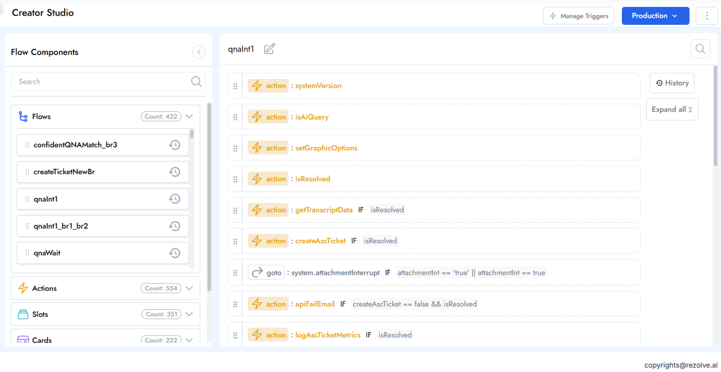
5: Creator Studio Flow Editor - Color Code for Components
We're excited to announce an update to the Bot Studio Flow Editor that enhances visual clarity and improves the user experience through a new color coding system for components.
What's New
-
Component Labels with Visual Indicators: Each component is now displayed with a badge that includes an associated icon and color code, making identification faster and more intuitive
-
Color-Coded Component Names: Component names are highlighted with their respective colors to enhance visual recognition at a glance
-
Reduced Visual Noise: Condition badges now appear in gray, decreasing their visual prominence and helping users focus on the main flow components
Benefits
-
Improved Visual Hierarchy: The new color system creates a clear visual distinction between different component types
-
Enhanced Scanning and Navigation: Quickly identify components when working with complex flows
-
Better User Experience: Redesigned component cards in both collapsed and expanded views for improved clarity.
6: Service Catalog - Ticket Type Color Coding System
We're excited to announce an enhancement to our ticketing system that introduces color coding for ticket types, making ticket identification faster and more intuitive across the platform.
What's New
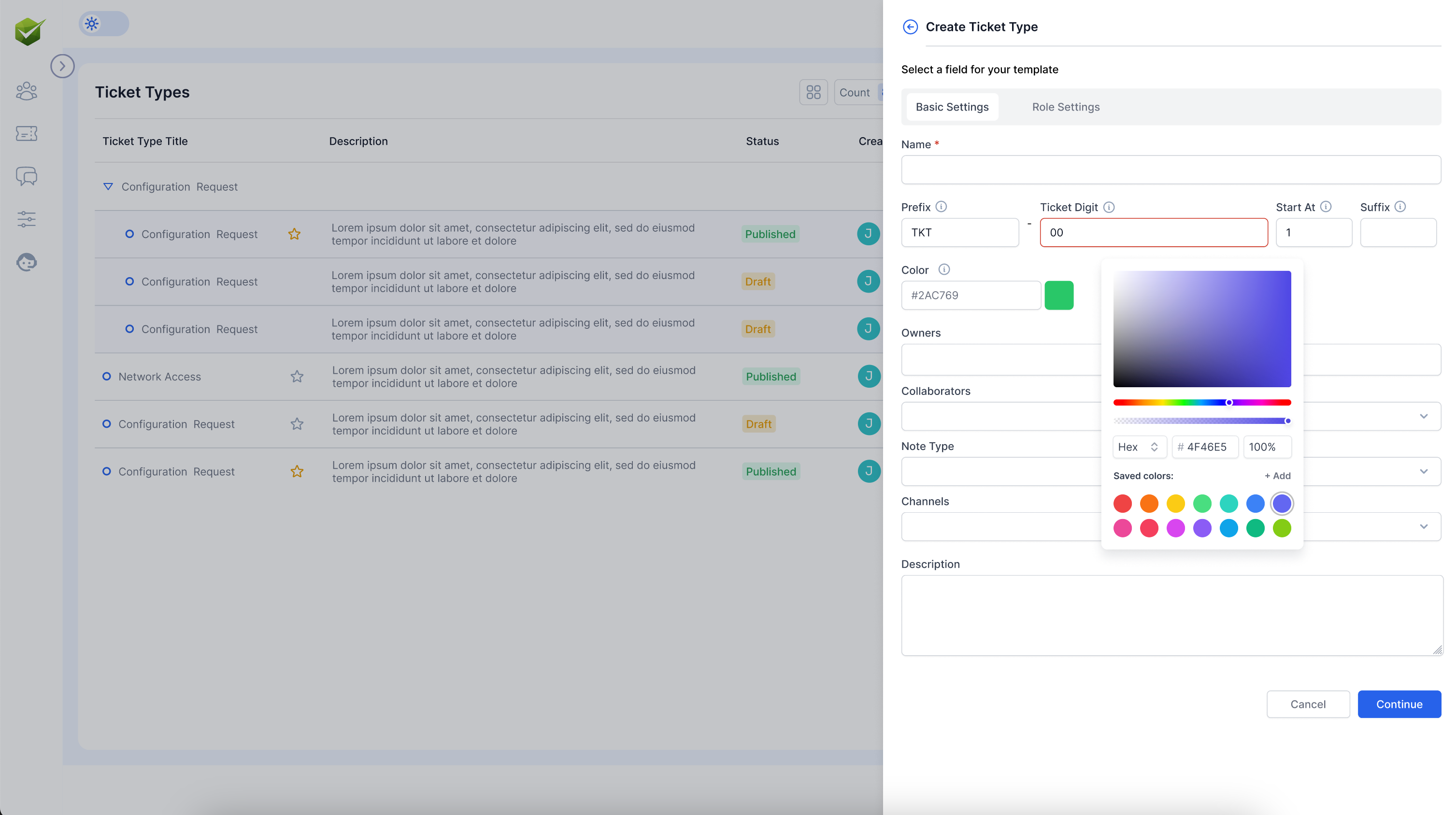
- Color-Coded Ticket Types: Each ticket type can now be assigned a unique color through the color picker in the ticket type creation interface
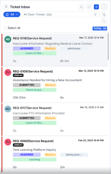
- Visual Identification in Agent Interface: Tickets are now displayed with their associated color in the agent inbox, making it easier to quickly identify ticket types at a glance
- Color Picker Tool: A comprehensive color selection tool with:
- RGB/HEX color input options
- Visual color selection palette
- Opacity/intensity controls
- Saved colors palette for consistency across your system
User Experience Improvements
- Enhanced Ticket Recognition: Tickets in the inbox display color-coded user initials (as seen in the inbox view with SA, AV, AP, CC)
- Status Clarity: Status indicators (RESOLVED, DRAFT, UNREAD, SUBMITTED) remain clearly visible alongside the color coding
- Consistent Visual System: Colors help create a cohesive identification system throughout the platform
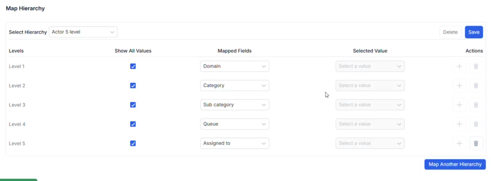
7: Actor and Queue Fields Enhancement
We're pleased to announce an important enhancement to our field configuration system that expands the capability of Actor and Queue fields.
What's New
-
Actor and Queue as Dependent Fields: Actor and Queue fields can now be configured as dependent fields within your forms and workflows
-
Hierarchy Data Mapping: Actor fields can now be mapped to Hierarchy data, providing more flexible data relationships
-
Default Value Selection: You can now choose default values for Actor and Queue fields in mapped hierarchy configurations
Key Benefits
-
Enhanced Form Logic: Create more complex and intelligent form behaviors using Actor and Queue fields as dependencies
-
Improved Data Relationships: Build more sophisticated data models by connecting Actor fields to your hierarchy data
-
Consistent Configuration Experience: Actor and Queue fields now work like any other level in your mapped hierarchies
Release Date: 13th March 2025
1: Dashboard and Reports – Ticket Data Accuracy Fix
Overview
We have resolved an issue where dashboards and reports sometimes displayed incorrect ticket data due to inconsistencies in data aggregation logic. This update ensures that all analytics and exports now accurately reflect the actual ticket records across the system.
Problem Addressed
Previously, users noticed discrepancies between ticket data shown in dashboards/reports and the underlying records. This resulted in potential misreporting of ticket volumes, statuses, and other key metrics, impacting operational and management decisions.
The issue occurred due to a redesign of chart-level access based on the product template, and now we have implemented the new design to ensure seamless functionality.
Fix Details
- Chart-level access is being redesigned based on the product template for improved security and flexibility.
- Due to this redesign, an issue occurred that caused dashboards and reports to display incorrect ticket data.
- The data aggregation logic has now been corrected to ensure alignment between displayed metrics and the actual ticket database.
- Export and subscription processes have also been updated to use accurate data.
Impact
- Dashboards now show ticket counts, statuses, and metrics that match the true state of the ticketing system
- Exported reports (CSV/PDF) and scheduled subscriptions reflect correct ticket data
- Improved confidence in analytics for all users
User Guidance
No user action is required. All dashboards and reports now display accurate information automatically. If you previously exported reports with discrepancies, we recommend re-generating them for the most up-to-date data.
2: Chart Level Filter Creation Issue
Overview
We have addressed an issue that was preventing users from creating chart-level filters within dashboards and reports. This fix restores full filter creation functionality, enabling users to customize their charts as needed for more targeted analysis.
Problem Addressed
Previously, users attempting to create chart-level filters encountered errors or were unable to save their filter configurations. This limited the ability to refine data views and impacted reporting flexibility.
Fix Details
- Resolved the error in the chart filter creation workflow
- Restored the ability to create, edit, and save chart-level filters for dashboards and reports
- Ensured compatibility with recent chart-level access redesigns
Impact
- Users can now create and manage chart-level filters without issues
- Enhanced flexibility for data analysis and reporting
- Improved user experience when customizing dashboards and reports
User Guidance
No user action is required. Chart-level filter creation now works as expected. If you experienced issues before, please try creating your filters again.
3: Ticketing V2 – Mark Resolved and Show Feedback Card
Overview
Once a ticket is resolved, the end user now receives a feedback link in the email notification sent upon ticket resolution. This link, labeled "Please submit your feedback" (similar to the previous 1.0 version), directs users to provide their feedback easily.
All submitted feedback is logged in the Ticket Dashboard and can be exported as a report. The Ticket Dashboard now displays star ratings as a chart per agent, and includes a data table with line items showing user comments for each feedback entry.
This enhancement streamlines the feedback collection process, ensures all feedback is centrally tracked, and provides actionable insights through both visual charts and detailed tables.
Problem Addressed
- No direct or automated way for end users to provide feedback immediately after a ticket was resolved.
- Feedback collection relied on manual follow-ups, resulting in lower response rates and delayed insights.
- Feedback was not centrally tracked or easily accessible for reporting and analysis.
- Difficulty monitoring agent performance and customer satisfaction in real time.
- No convenient way to visualize star ratings per agent or review user comments in a structured, exportable format.
Fix Details
- Implemented a direct feedback link in the ticket resolution email notification.
- Centralized feedback tracking and logging in the Ticket Dashboard.
- Added star rating charts and detailed feedback tables for actionable insights.
Impact
- Streamlined feedback collection process.
- Improved response rates and timeliness of feedback insights.
- Enhanced agent performance and customer satisfaction monitoring.
- Actionable insights through visual charts and detailed feedback tables.
User Guidance
No user action is required. The feedback link is now automatically included in ticket resolution email notifications. If you previously relied on manual follow-ups for feedback, you can now use this streamlined process.
4: Filter data issue in dashboard
Overview
An issue was identified where dashboard filters for date ranges such as Today, Yesterday, Last Week, and Last 30 Days were not displaying ticket data correctly. This resulted in dashboards showing zero counts even though tickets existed for those periods in the inbox data.
Problem Addressed
- Filters for Today and Yesterday showed no data in dashboards, despite tickets being present.
- The Last Week filter was incorrectly excluding 6 days from today instead of the full 7 days.
- The Last 30 Days filter excluded today's and yesterday's tickets, leading to incomplete data display.
Fix Details
We are redesigning chart-level access based on the product template. Due to this change, an issue occurred that affected filter data display in dashboards. The filter logic has now been reviewed and corrected to ensure accurate data is shown for all date ranges, including Today, Yesterday, Last Week, and Last 30 Days.
Impact
- Dashboards now accurately display ticket data for all date ranges.
- Improved data accuracy for operational dashboards and reports.
- Enhanced user experience when using dashboard filters.
User Guidance
No user action is required. Dashboard filters now work as expected. If you experienced issues before, please try using the filters again.
Release Date: 18th March 2025
1: Announcements are sending out more 4-8x more than expected
Overview
- Announcements (such as scheduled bot notifications) were being sent out 4-8 times more than expected.
- The issue occurred when jobs were deleted and recreated, resulting in users receiving multiple duplicate notifications for the same announcement.
- This caused confusion and potential disruption for end users.
- The problem was identified during client testing, which prevented a wider organizational impact.
- Highlights the need to prevent duplicate Teams notifications and ensure proper handling of job deletions and recreations.
Problem Addressed
- Announcements were being sent multiple times due to missing or incorrect interval checks.
- Batch processing logic did not prevent duplicate notifications when jobs were deleted and recreated.
- The notification scheduling mechanism was not optimized, leading to incorrect notification intervals and frequency.
Fix Details
- Implemented interval checks to prevent announcements from being sent multiple times.
- Added logic to prevent duplicate notifications when jobs are deleted and recreated.
- Optimized the notification scheduling mechanism to ensure correct notification intervals and frequency.
Impact
- Users will no longer receive duplicate announcements.
- Announcements will now be sent at the correct intervals and frequency.
- Improved user experience and reduced potential confusion.
User Guidance
No user action is required. Announcements will now work as expected. If you experienced issues before, please try using the announcements again.
2: Citation is breaking intermittently
Overview
- Citation is breaking intermittently when a query is responding with the answer.
Problem Addressed
- The citation feature was intermittently failing to render properly, causing issues in displaying sources within the card.
Fix Details
- Implemented a new validation check to ensure all formatted sources are properly recognized and displayed.
- Added fallback mechanisms to prevent citation failures if a source is missing or misformatted.
Impact
- Citations are now reliably rendered and displayed within the card.
- Reduced risk of data loss or missing source information.
- Improved user confidence in citation accuracy and reliability.
User Guidance
No user action is required. Citation rendering and reliability have been improved automatically. If you experienced issues before, please try using the citation feature again.
3: The source is not reflecting in the ticket. Ideally, the source should be automatically populated in the ticket, but it appears blank for all tickets.
Overview
- The source field in tickets was not being automatically populated and appeared blank for all tickets, even though it should be filled by default.
Fix Details
- In the create layout, the source field was missing.
- Added the source field and reimported the template to restore correct behavior.
Impact
- The source is now automatically populated for all tickets as expected.
- Improved ticket traceability and reporting accuracy.
User Guidance
No user action is required. The source field will now be correctly populated in all new tickets.
4: Not able to check the LLM for PAT
Overview
- The LLM for PAT was not accessible, making it difficult to verify its functionality.
Fix Details
- Implemented real-time value substitution to support different PAT inputs.
- Improved validation checks to prevent hardcoded issues.
- Removed hardcoded values; the system now accepts and processes actual user-provided values instead of static ones.
Impact
- LLM which is working on the tenant is now visible when checking the LLM model in the config app.
- Improved reliability and transparency for PAT and LLM configuration.
User Guidance
No user action is required. The LLM for PAT will now show correctly in the config app and reflect user-provided values.
5: Getting the text as MainMenu instead of the home icon after getting response for the query
Overview
- Users were seeing the text "mainMenu" instead of the home icon after receiving a response for a query in the Slack bot.
- This caused confusion in the UI, as the expected home icon was replaced by a literal text label.
Fix Details
- Updated UI rendering logic and adjusted the response handling mechanism to correctly interpret and display icons instead of text labels.
Impact
- The home icon is now correctly displayed instead of the text "mainMenu" after receiving a response in the Slack bot.
- Improved user experience and interface clarity.
User Guidance
No user action is required. The Slack bot will now display the correct home icon automatically.
6: Service Portal in Production environment is not as like shown in Beta environment.
Overview
- The Service Portal in the Production environment did not match the appearance and functionality of the Beta environment.
- Users noticed inconsistencies between the two environments, leading to confusion and potential issues with navigation or feature access.
Problem Addressed
- The Service Portal in the Production environment did not match the appearance and functionality of the Beta environment.
- Users noticed inconsistencies between the two environments, leading to confusion and potential issues with navigation or feature access.
Fix Details
- Cleared the cache of metafield data in Production to resolve inconsistencies.
- Implemented mechanisms to periodically refresh cache and prevent similar issues in the future.
- Ensured metafield structure and settings match across Production and Beta environments for real-time updates.
Impact
- Service Portal in Production now matches the appearance and functionality of the Beta environment.
- Users experience consistent navigation and feature access across environments.
User Guidance
No user action is required. The Service Portal in Production will now reflect updates and match the Beta environment automatically.
7: Issues with SLA Metrics & Report Download Formatting
Overview
The following issues with SLA metrics and report downloads were identified and required urgent attention:
-
PDF Report Download Formatting Issues
- Exported PDF reports were not readable due to formatting issues.
- Graphs were cut off, header tabs wrapped, and layout was not aligned with standard A4 size.
- Reports lacked proper structure, making details hard to find and interpret.
-
CSV Report Formatting Issue
- Downloaded CSV reports merged all data into a single table, making analysis difficult.
- Tables lacked separate headers and were not organized into different sheets for clarity and usability.
-
SLA Metrics Not Functioning Properly
- SLA breach indicators for Resolution SLA and Response SLA were not accurate.
- No clear visibility on whether a ticket breached SLA timelines, impacting tracking and reporting.
-
Graph Label Overlapping
- Labels on pie charts, bar graphs, or column charts overlapped, making data hard to interpret.
- Visualization needed adjustment for readability and clarity.
Fix Details
- Reformatted PDF reports to fit A4 size with readable content and properly structured layout.
- Structured CSV reports with distinct headers and separate sheets for each table.
- Fixed SLA tracking so breach indicators now work correctly.
- Adjusted graph labeling to prevent overlaps and improve clarity.
Impact
- PDF and CSV reports are now more readable and user-friendly.
- SLA tracking and breach indicators are accurate, improving reliability of reporting.
- Graphs and charts are easier to interpret, enhancing data visualization.
Root Cause Analysis (RCA)
Whenever modifications are made to the DW UI chart, the same changes must also be applied to the DW subscription. In this case, the service was not updated accordingly, which led to PDF charts not displaying correctly.
User Guidance
No user action is required. Reports and charts will now display correctly and provide accurate, clear information.
8: Offer Value for product name and category is blank
Overview
- Offer Value for product name and category was appearing blank on the Offers screen.
Root Cause Analysis (RCA)
- In the Catalog, the values of dependent options were changed from label to key (UUID), but the Offers screen was not updated for backward compatibility.
Fix Details
- Updated the Offers screen logic to handle key (UUID) values from the Catalog and maintain backward compatibility.
- Ensured that Product Name and Category fields now display correctly.
Impact
- Product Name and Category fields are now visible and accurate on the Offers screen.
- Prevents display issues when Catalog option values are updated to keys.
User Guidance
No user action is required. Product Name and Category fields will now display correctly in Offers.